🧑🏻💻 DCAP Dashboard - Collateral Management
About the project
🤔 What is it?
The DCAP dashboard is meant to be a platform to automate onchain collateral upkeep for Intel SGX (Software Guard Extensions) and TDX (Trust Domain Extensions), serving as a unified system to manage and monitor quote verification using DCAP (Data Center Attestation Primitives), ensuring the trust chain between enclaves and the root of trust remains intact and valid. It also automates the lifecycle of collateral files with real-time visibility, reducing operational complexity and preventing silent failures on attestation workflows.
🧠 Rationale
As a business owner or a user that champions on-chain attestations or hardware verification as a method of validation for any products and platforms, keeping up with collateral updates and other related elements can be a hard task, and failing to do so can lead to silent failures that would create vulnerabilities in the attesting process, or directly break the whole functionality of a validation tool. How could this process of keeping collaterals updated be simplified? How could the user be notified and kept up to date with their validators? This is where my work came in when conceptualizing and helping Automata to create the DCAP dashboard.
🎯 The challenge
Create a tactical view dashboard, featuring all the needed info at first glance;
Identify good and bad practices for dashboards, and ensure the experience created has depth;
Develop features that can help the user not only maintain but interact with their collaterals;
Deliver an intuitive user experience, even if tailored for high-level users;
Developing the concept
🔬 Research and analysis
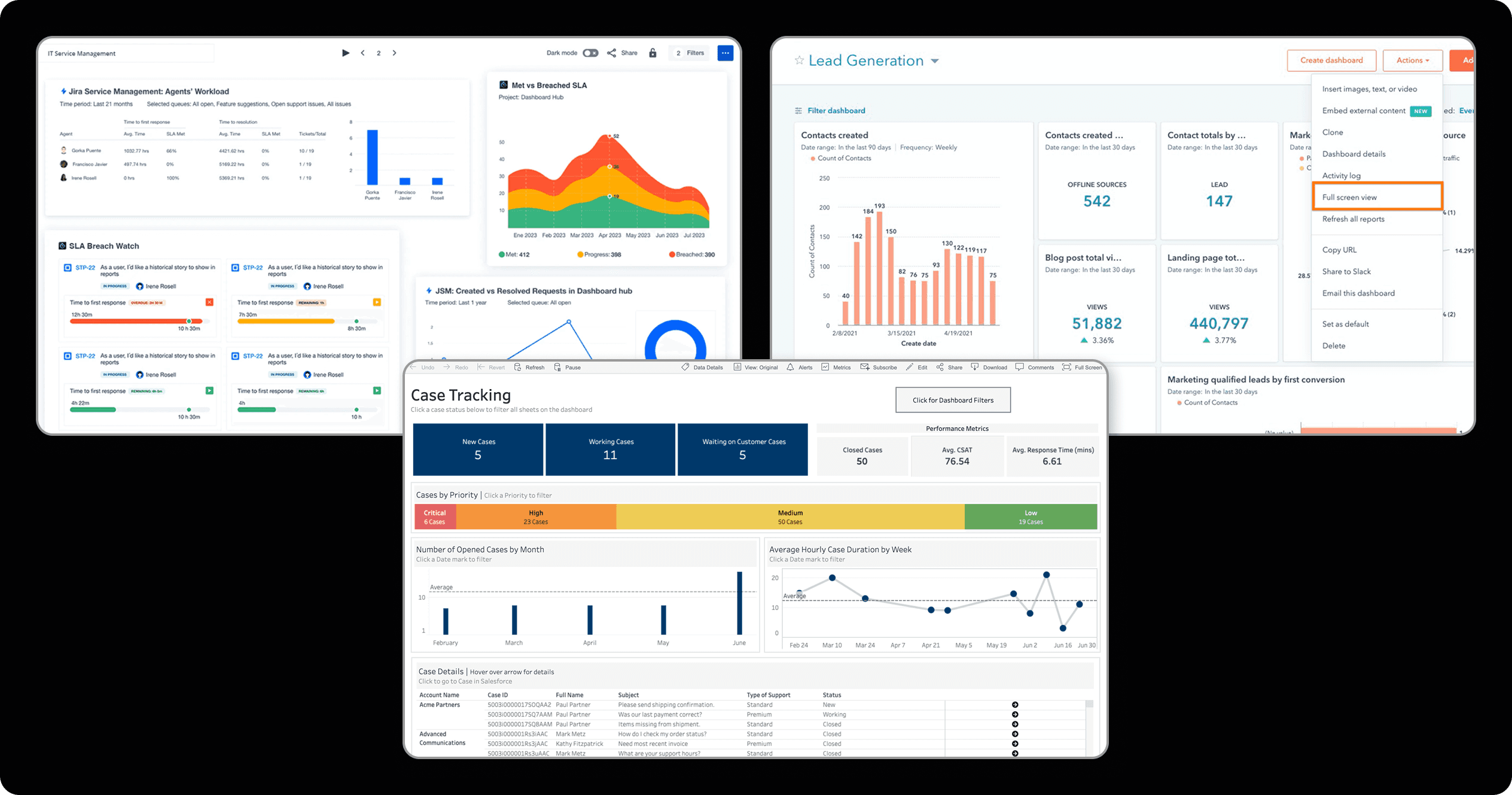
Since this project sought to understand good practices about high-level data display dashboards, so we could build our own platform with the maximum visual clarity, a good starting point was checking out other interfaces of the sort! Since dashboards are broadly used in the tech area, finding suitable examples was a quick task. Within multiple choices, we selected Jira, Tableau, and HubSpot. These featured good displays on status-related data, solid usage of charts and graphs, and some nice clean info delivery; By checking them out, we got a good grasp on how we could be displaying our data for the users!
🔍 Finding the edge
After some deep research, the next step was defining key-features and ideas that we would be offering to our users! Many concepts and ideas were brought up, and here are the ones that stood out:
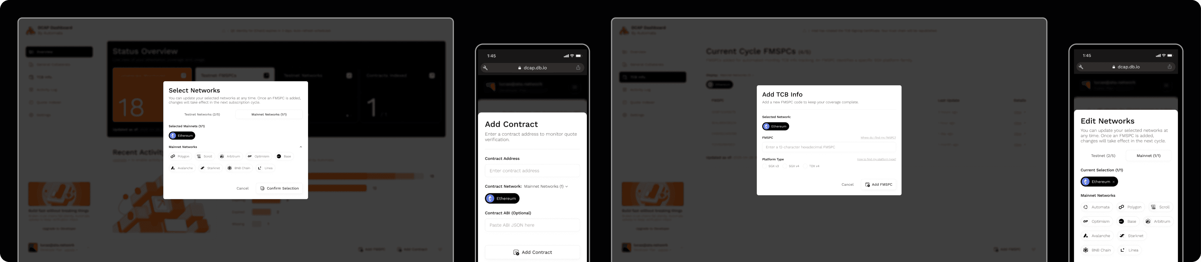
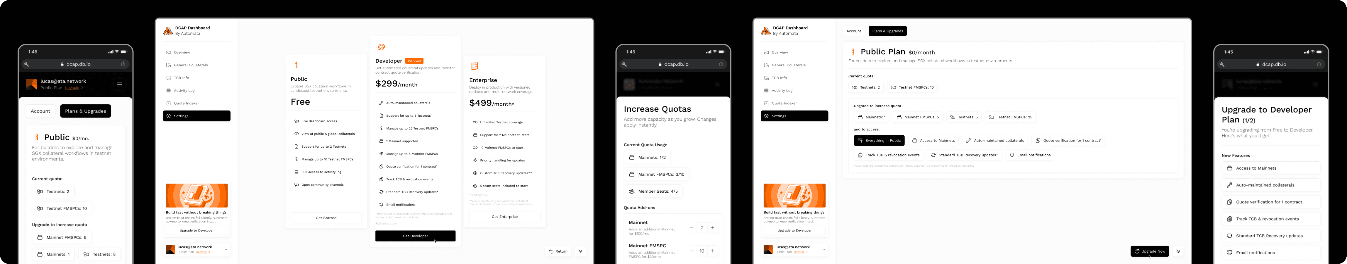
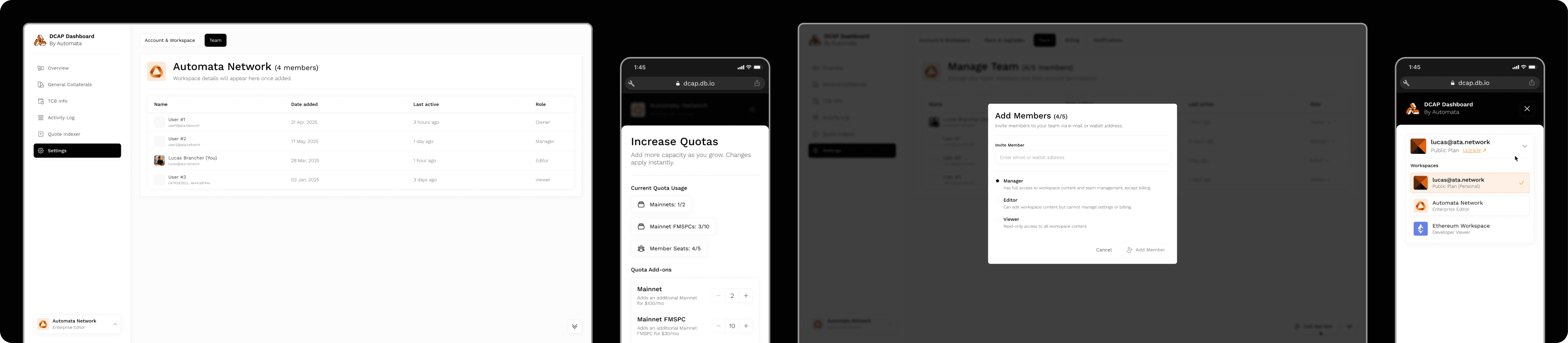
Easy-to-reach core info:One of the main challenges for this platform was finding ways of displaying multiple qualitative elements and metrics as quantitative data that is easy to read through. Even further than that, the main objective was covering all the relevant global events and statuses at first glance. As a solution for that, we came up with a main view dashboard that features a bit of everything: overviews on multiple tabs, recent activity, collateral statuses, and more;Meaningful statuses:For complex elements like collaterals and TCB (Trusted Computing Base) details, a simple "Working" or "Not working" status simply wouldn't cut it; That's why we came up with a plethora of different statuses tied to many functions on the dashboard, so that the info the user got was clear, easy to read and process;Intuitive registering:Even though we are working with high-level users mainly, being able to facilitate usually grindy processes is key. For that, we made sure that the tasks of selecting networks, registering FMSPCs (Family-Model-Stepping-Platform-Custom SKU identifiers) and others were as simplified as possible through well-structured modals and input groups;Pricing made clear:Since this was a subscription based platform, with not only plans, but also addons, there was a clear need for well explained details when it came to monthly billings, elements set to take action, elements already taking action, etc. For that, we applied multiple signifiers and views throughout the interface, separating the notions of "Happening" and "Set to happen" while facilitating a clear understanding of how the user was interacting with the dashboard;Scalable usage:Such a powerfull tool shouldn't and can't be bound only to single-user activities. To ensure that ain't the case, we worked diligently on creating efficient team creation and management tools, where users can seamlessly flow from a self-owned view, to an org-tied space;
Understanding the user
👤 Using personas
Now with a solid grasp obtained by researching and defining concepts, we were ready for the refinement step: creating our persona! As a quick reminder, personas are vital for understanding who your target user is, and what pain points you will be resolving for them. Your ideas and concepts brought up in the previous stage of research will be tested!
👨💻 Jacob, 32 years (Attestation champion)
"I can't believe how far this whole attestation thing has taken me! I can now ensure that devices operating on my platforms are truly who they seem to be using all of those collaterals for verification, and this is awesome! The only problem is, how can I really keep up with updating my system? Things happen outta nowhere and I find myself scrambling to achieve consistency… I had three scares this month already, ain't looking forward to a fourth. Wish there was a way of making this whole process easier, maybe automating the updates and registry…"
💭 Motivations
Wants to keep on using collaterals for platform attestations;
Wants a service that automates the hard parts of maintenance;
Wants a quick view of his ongoing validation services;
💔 Pain points
Is tired of getting randomly hit with downtimes on his services;
Feels like keeping up their collaterals shouldn't be that hard;
Is tired of having to manually perform grindy tasks for updating their validation tools;
Defining the user flow
📖 User stories
After understanding our persona, we created the user stories, which is the final step to tying our new design ideas with our end-user needs. Some examples below:
Tactical dashboard:"As a user, I want to receive ALL the relevant info regarding the health of my services right when I log into the platform";Clear statuses:"Sometimes, "running" and "not running" aren't enough, so I would like to get some richer and detailed statuses";Registering made easy:"As a power-user, I know that the processes of registering new networks or FMSPCs can be a hassle sometimes, so I'd love to have a well-made interface to facilitate that";Clear pricing:"If this is a pay-per-use service, I believe that things can get pretty messy, unless the platform organizes clearly what's this month's payment, and what's next month's one. I don't want any surprises since I know this can be pricey";Scalability:"I believe my usage of attestations can become even broader, and with that, more people will be joining me, I'd like this platform to have a "teams" option or something of sorts";
🫚 User flow
Having all of these done, we created our definitive user flow! This tool shows a simplified view on how we expect the user to interact with the dashboard proposed:
Working on the structure
✏️ Wireframes
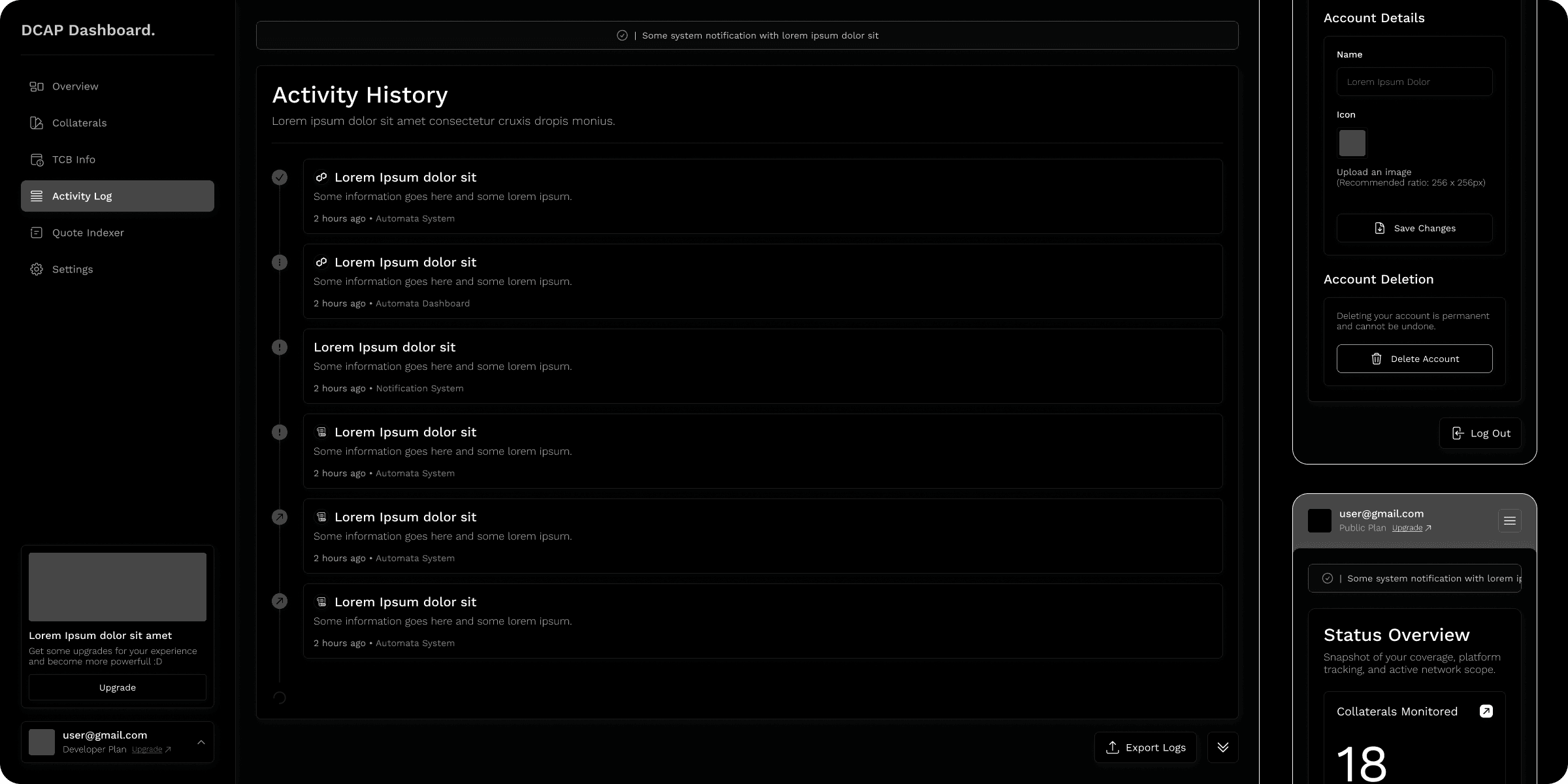
With a working user-flow, the creation of our wireframes was the next step! This is a vital part of the UX process that allows us to understand some key interactions on our project, and get some screen ideas flowing:
Working on the visuals
😎 Setting the mood
With our wireframes done, now we needed to define a visual style. This would be our compass through all the UI decisions throughout the rest of the process. For this interface, the key words are: minimal and high-contrast, with a focus on ensuring info can be as easy to read through as possible;
🎨 Colors
When it comes to colors, even more on a dashboard, there's a need for high-contrast and good readability! A study by Jonathon Dobres and his team revealed that users in light mode exhibited faster judgment times compared to those in dark mode, and for that reason, this dashboard shall be featuring a lighter background, with dark texts and orange colors (matching the company identity as per habit);

✍️ Fonts
For fonts, we went with the usual font family to Automata's ecosystem, Work Sans! The usage of this font delivers great readability, fitting into the needs of our dashboard and data-reading experience.
Shapes
For shapes, mainly for dashboards, the meta is a blocky look, but since we're going with making it clean-looking and user-friendly, we can afford to feature square blocks and buttons with a subtle border radius. Nothing too overbearing, but also a nice touch;
The results
Within this project a total of 151 desktop screens, and 157 mobile counterparts were created. Within these, here are some of the results achieved:
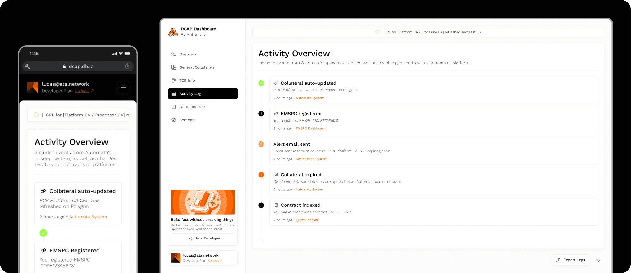
1️⃣ Ready-to-view info
With the heavy focus on displaying relevant info at first, the users can easily log in and receive at first glance all the relevant bits of data regarding their collaterals and operations;
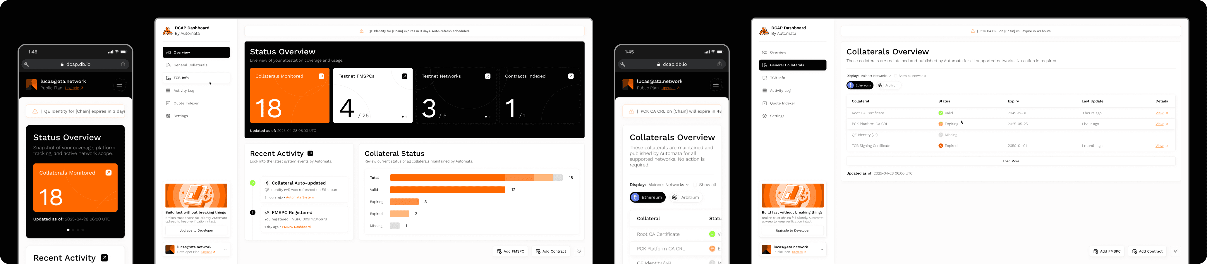
2️⃣ Statuses that matter
Since we wanted to be as meaningful as we could with each and every system status, we came up with 33 of them, covering each and every different thing happening with the user's services;
3️⃣ Intuitive processes
Since this would also be a tool of many flows, ensuring every single modal, input group and such would be quick and easy to use was a must. This is why we made sure that every process was as clear for the users as it should be. No more grinding!
4️⃣ Plans made easy
To ensure the plans and payments would always be as clear as day, we made sure to create flows filled with signifiers, from upgrades to downgrades, from setting up your free plans to achieving max power with enterprise plans;
5️⃣ Work by yourself or with a team
The DCAP Dashboard is ready to be the perfect fit for any size or need, from the power-user to the attestation-empowered business; this is why the product launched with a robust account environment where you can quickly exchange between your own space and a company enterprise space;
The outcome
With the completion of this project, the DCAP Dashboard was delivered and launched, delivering top-notch data visibility, easy and intuitive collateral maintenance, and conquering all the challenges established on the research stage.
You can check a few selected screens from this project on the figma link below:


