👄 Rumour App - Social-based Trading
About the project
🤔 What is it?
Rumour is meant to be a trading app on Web3, that focuses itself on creating a social experience around markets and public opinions around them. In it, users can create and spread rumours, based on personal takes or fresh news, influencing and gathering other like-minded folks into trading those pairs. It allows users to chat, group with like-minded individuals, and trade based on that, seeking to get an edge on the market.
🧠 Rationale
In an interconnected era, trading has been a social-influenced environment for long, but most of it has always been locked behind closed doors… Privileged information, afterhours markets, financial gurus: ways that people have used time and time again to earn money on market swings while trading. What if this social aspect was more accessible to the common folk? What if your next chat with an internet stranger held the next big hot take on market? From this rationale, Altlayer came up with the Rumour app.
🛠️ How it came to be
This product was already in beta stage when I was invited to join their ranks as a consultant and give a visual overhaul to it, as the company had some concerns on the looks they were aiming for being half-done, the functionalities being unintuitive, and the platform still holding space for improvements and scaling. This is where my work came in when conceptualizing and helping Altlayer to upgrade their Rumour app.
🎯 The challenge
Identify weak points in their user experience and upgrade functionalities when needed;
Solidify their original ideas on UI styles, ensuring the looks match the expectation;
Restructure their internal files, which were missing a few screens compared to the live test versions;
Deliver an update that will make the app usage even more enjoyable for users;
Developing the updates
🔬 Initial analysis
Since we're talking about a revamp, the most relevant thing to do is applying our own expertise into their project, ensuring that all the rough edges can be rounded, delivering a better UI/UX all-in-all. For that, and thanks to their amazing collaboration efforts and willingness to share internal documents, we got access to the original Figma file of the project, being able to revise all screens, seeing what can be improved directly.
🔍 Finding what's missing
After some internal reviews, the next step was defining the most relevant upgrades that could be applied to the project as a whole. Within this search, these were the key points that came up:
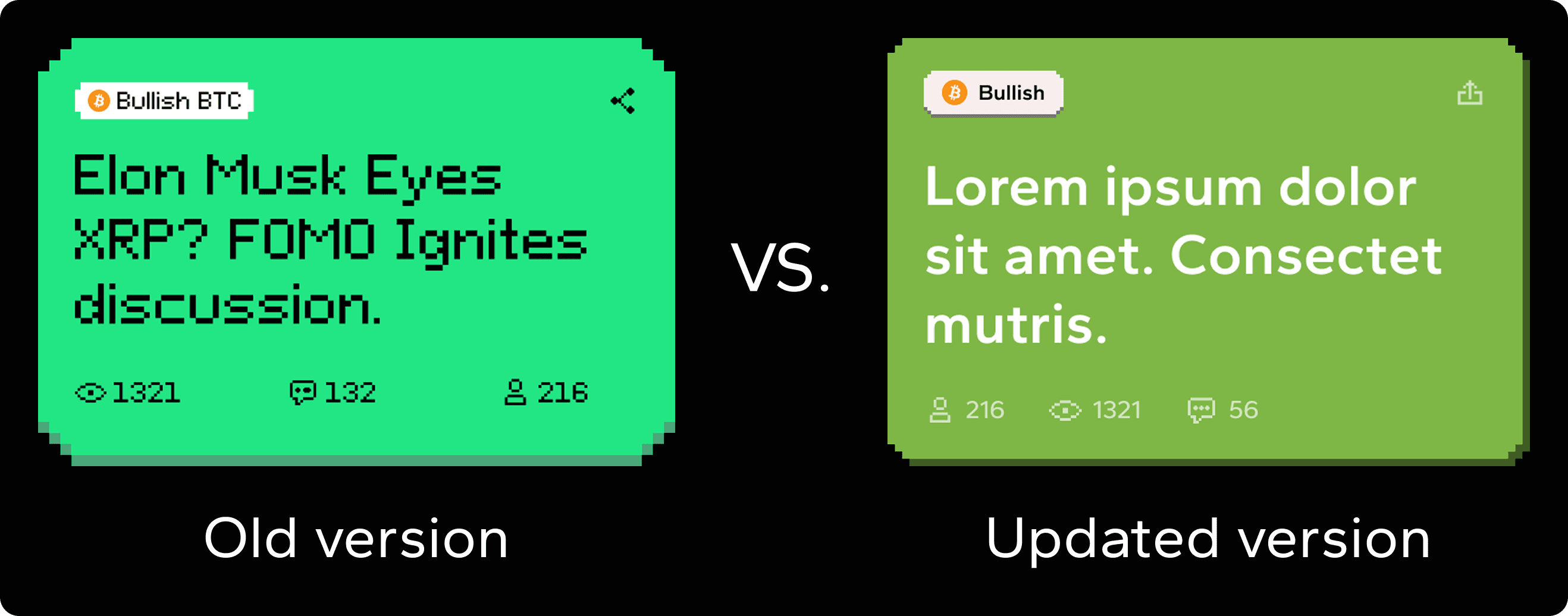
Figma structure:Before even starting with design in general, it's always necessary to have an organized and well-structured design environment. We noticed the lack of ordering on the file, the lack of separation between different flows, the lack of auto-layouts and component usage (two of the biggest strengths in Figma), and even missing screens that weren't accounted for. For this, the main solution would be, of course, revamping the whole file, ensuring best practices were utilized!UI and identity:Even though they had a solid idea of what they wanted for looks: a 16bit stylized interface, with broad pixel-like usage, the current execution they had wasn't matching their expectations. For this, a solid UI work and brand development work was conducted to ensure we found the sweet spot;Doubling down on good UX:Their original ideas for creating a good product worked in most instances, but since there's always some space for improvements, this is what we did! Every screen got a bit more of love when it came to signifiers, clear navigation, better contrast, better hierarchy, etc;More power to the user:Within the analysis stage, space for improvement was also found on common functions like search mechanisms, group configurations, the way users interact with the timelines, etc. For all of these, some extra details were added, focusing on taking the experience to a new level;
Understanding the user
👤 Using personas
Now with a solid grasp obtained by revising what was done, and defining what needed upgrades, we were ready for the refinement step: creating our persona! As a quick reminder, personas are vital for understanding who your target user is, and what pain points you will be resolving for them. Your ideas and concepts brought up in the previous stage of research will be tested!
Persona 1 (User)
👨💻 Nicole, 22 years (Influencer, trader)
"Oh my! This Rumour app was exactly what I was looking for! I love the features focused on being able to spread hot takes and influence other traders! I've also been having fun chatting a bit with other users… But that out of the way, I hope this beta version still has lots of space for improvements, as I even sent some ideas on their discord myself. It's kinda rough around the edges… Not that it takes away from the experience, but I'd enjoy this app way more if some weird interaction quirks and the off-putting color palette went away."
💭 Motivations
Already likes the platform, and is looking forward to updates;
Wants to be able to share even more rumours with a larger user base;
💔 Pain points
Feels like the current visual presentation of the interface looks rough;
Misses the presence of quality of life-focused features and details;
Thinks that some interactions on the app may feel a bit quirky;
Persona 2 (Team)
👨💻 Lin Zhao, 36 years (Front-end developer)
"Okay, I'm finally done with coding the beta version of this platform; what a journey! The product looks alright, but I had to manually create the responsive breakpoints, manually code all component classes, and it was hard to find myself inside that Figma file; it honestly looked like a mess… I wish we could have a healthier production environment, so I could focus more on ensuring everything works properly."
💭 Motivations
Would like to have a more efficient and organized work environment;
Wants their designers to use the best practices when creating screens for dev hand-off;
💔 Pain points
Feels like they lose too much time having to find themselves around project-related Figma files;
Ends up getting extra work cause the screens being provided aren't technically sound, only superficially done;
Upgrading the user flow
📖 User stories
After understanding our personas, we created the user stories, which is the final step to tying our new design proposals with our end-user needs. Some examples below:
Better browsing:"As a user, when browsing for rumours, I would prefer to have filtering options, like specific tokens or dates, rather than only having a simple time-based feed";Better looks:"I would really like this project to double down and better execute the pixel art style, I think it would look so cool if it wasn't half-baked like it currently is";Better usage:"As a user, of course I'd like things to be more flowy, more intuitive, more linear when possible… The less I have to think, the more I can spread rumours and trade";Healthier file:"As a developer working on this project, yes, I'm definitely interested in having a better quality of screens being handed off to me, and I would also like to have the file more organized";
🫚 User flow changes
Having all of these done, we can now define exactly where things change in the already existing user flow! Take a look at this example and see the tweaks we performed on the inner FTUE (First time user experience) flow:
Reworking the visuals
😎 Solidifying the mood
Altlayer wanted a pixel-like approach to the interface. Their first take on it was a valiant effort, but they needed to go deeper into this style to achieve their desired results, and this is exactly what we did; take a look:
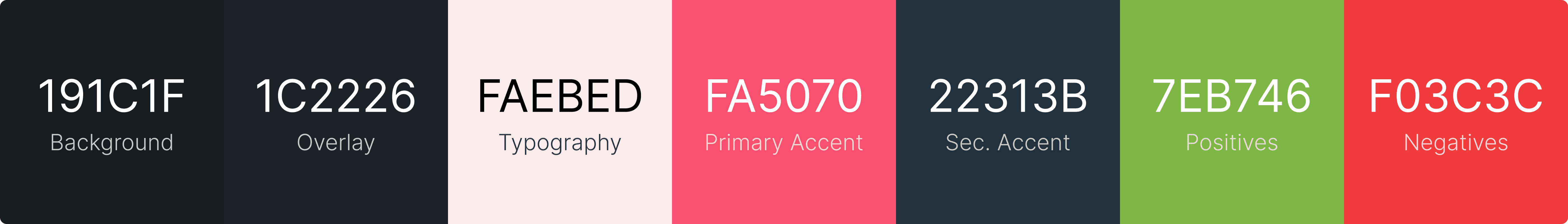
🎨 Colors
When it came to colors, the original palette was this one:
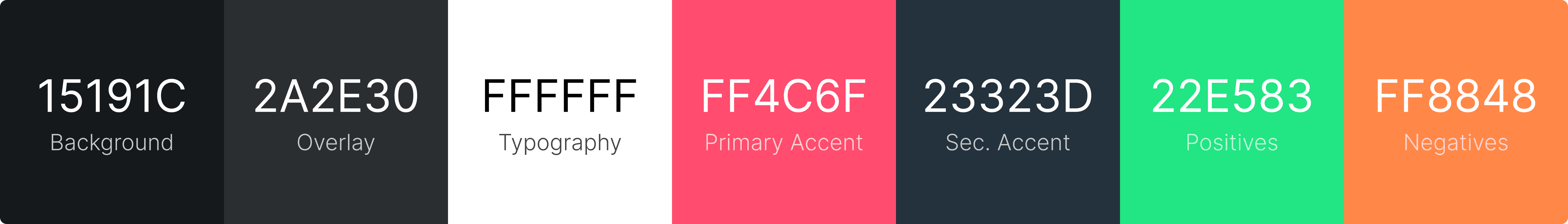
It wasn't bad, but it also wasn't as smooth as it could be; to fix that, we went through a full rework and re-structuring of the colors, focusing on something more balanced and with cleaner contrast.
✍️ Fonts
The original font present, Pixeloid sans, was within theme, but unfortunately, presented hard readability in all instances, forcing cognitive workload during reading; this had to change.
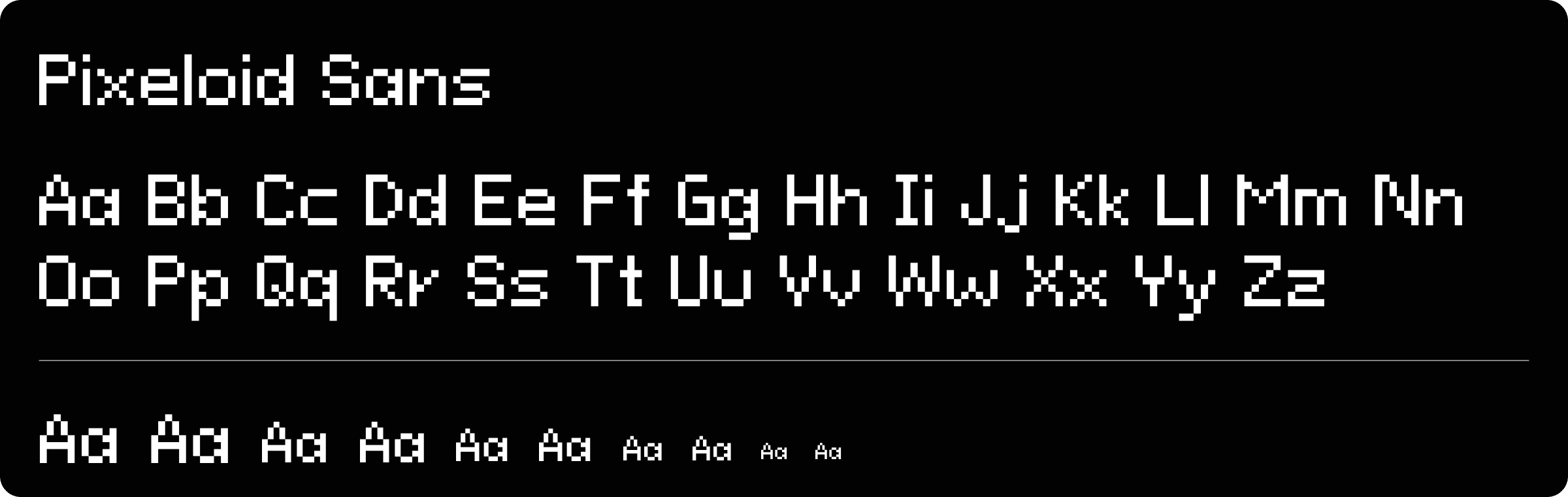
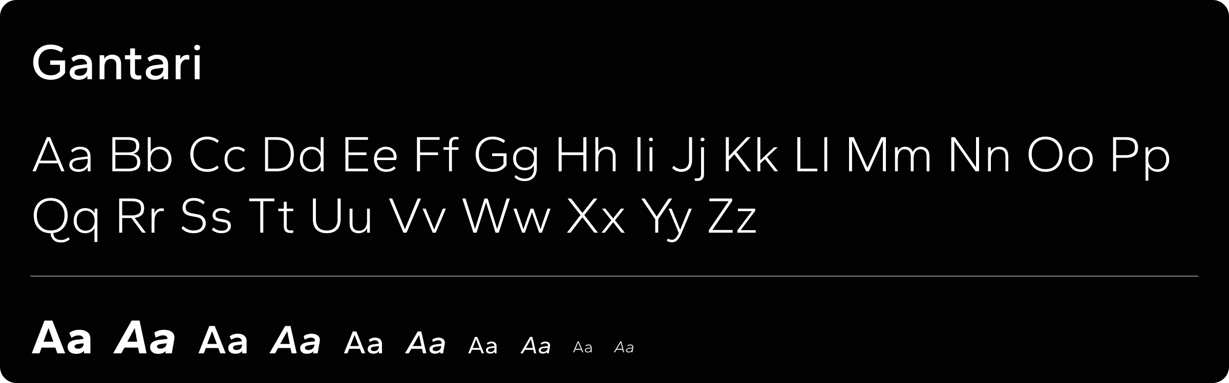
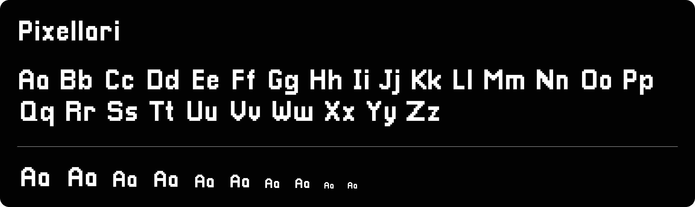
For that, we decided on a more balanced approach, with two fonts instead of one. Gantari for its great readability and clean looks, and Pixellari for titles and impact texts, to keep that beautiful pixel text, but now with a font that actually delivers a good reading experience;
Shapes
This part was more of a refinement; they already had some pixel borders and shadows going on, so we just doubled down and focused on fleshing that out more. See the comparison below:
The results
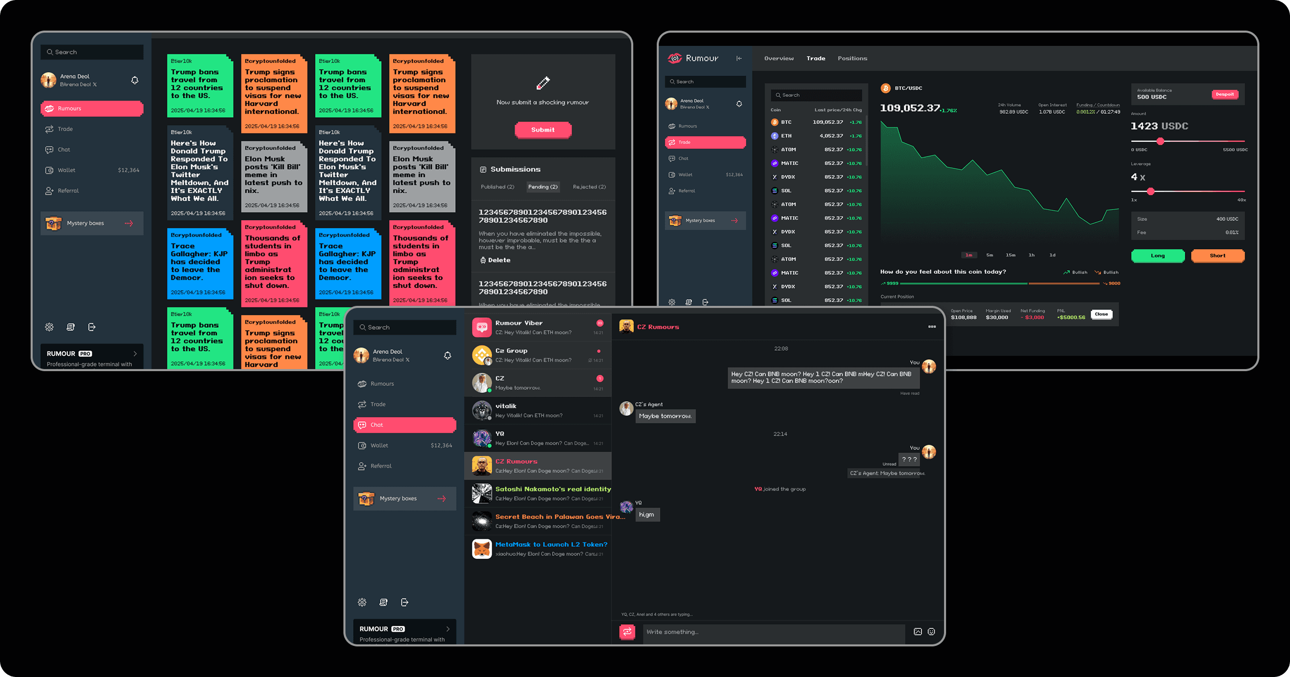
Within this project, between reworks and screens that were missing from the original Figma file, a total of 104 desktop screens and 106 mobile counterparts were created. Within these, here are some of the before and afters for core project screens:
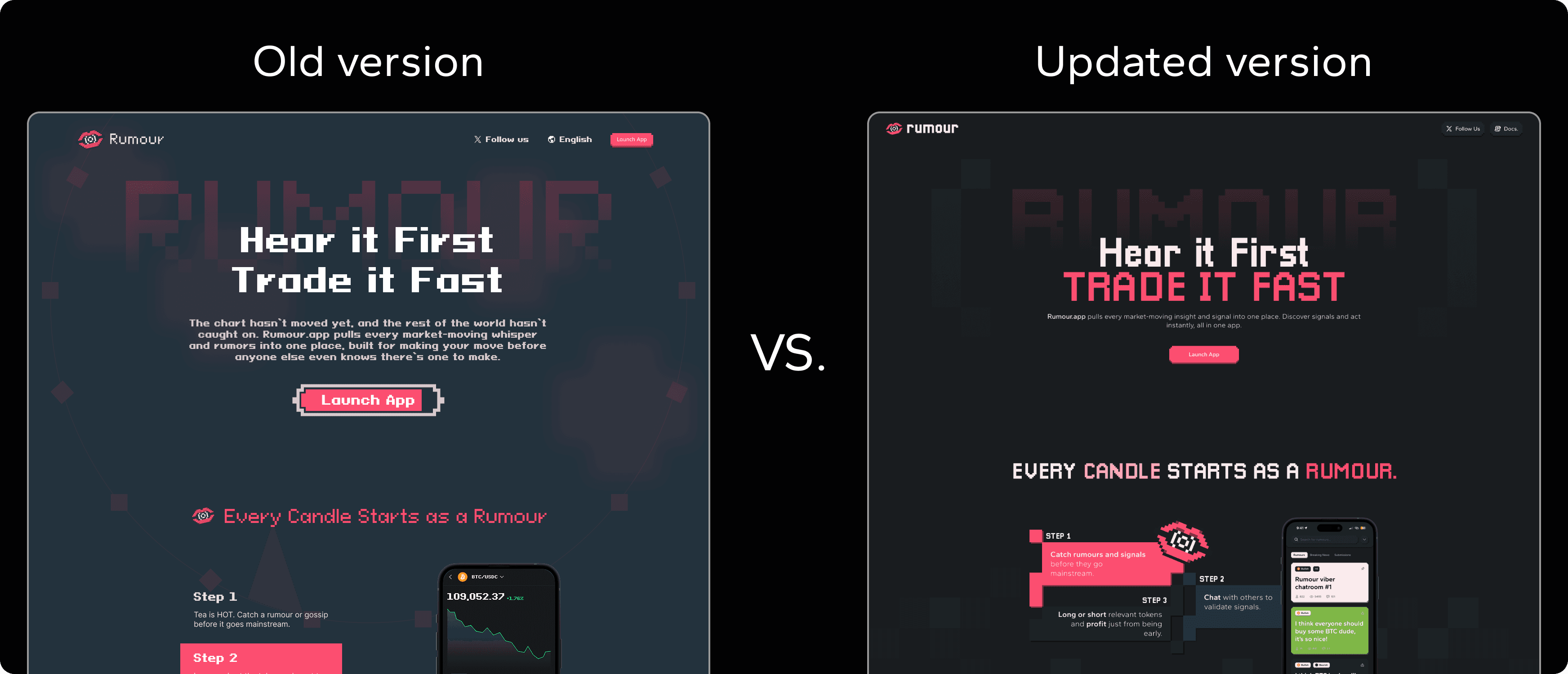
1️⃣ Landing
With a completely refreshed look, we made sure to make the landing page become the first and definitive showcase of the new, refined visual styling, so all the new and returning users know what to expect;
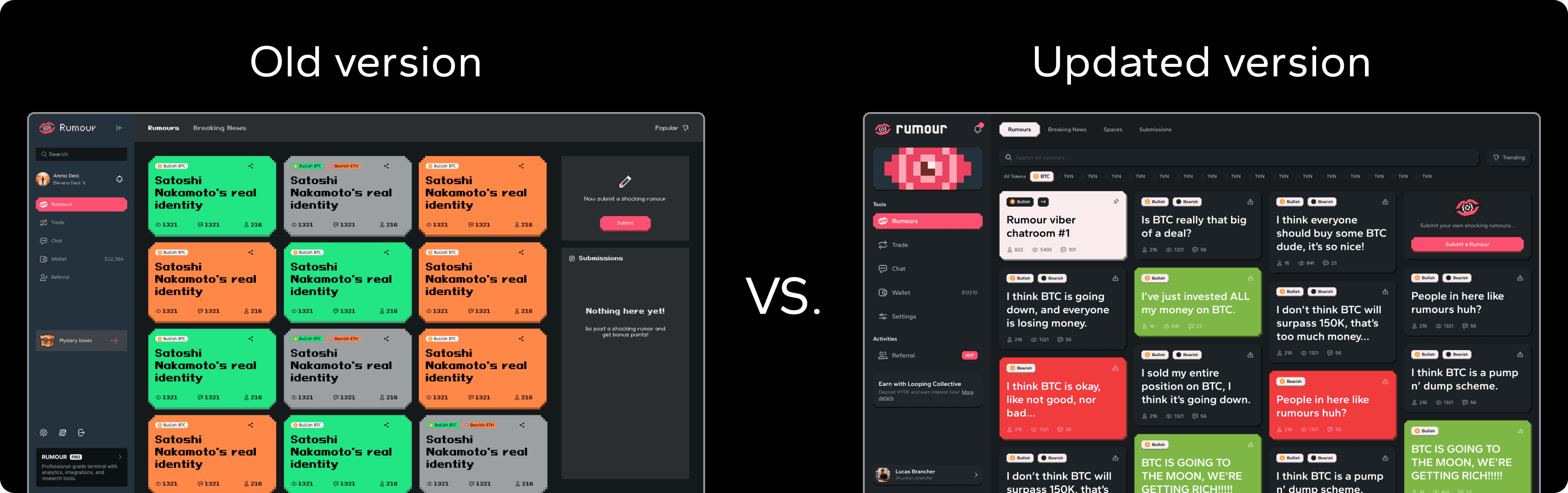
2️⃣ Rumours
With the color rebalancing, refined shapes, and quality of life changes on the rumour creation interface and searching tool, this opinion sharing feed just became smoother and a joy to navigate;
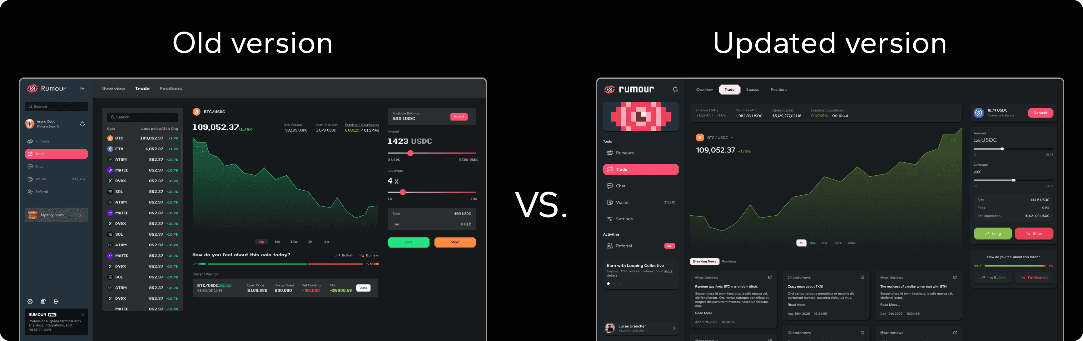
3️⃣ Trading terminal
With the addition of trading pair-oriented rumour previews in the bottom-part of the terminal, and with some signifier upgrades for the public sentiment displays, this part of the interface became closer to the main concept, tying everything together nicely and delivering a more on-theme user experience;
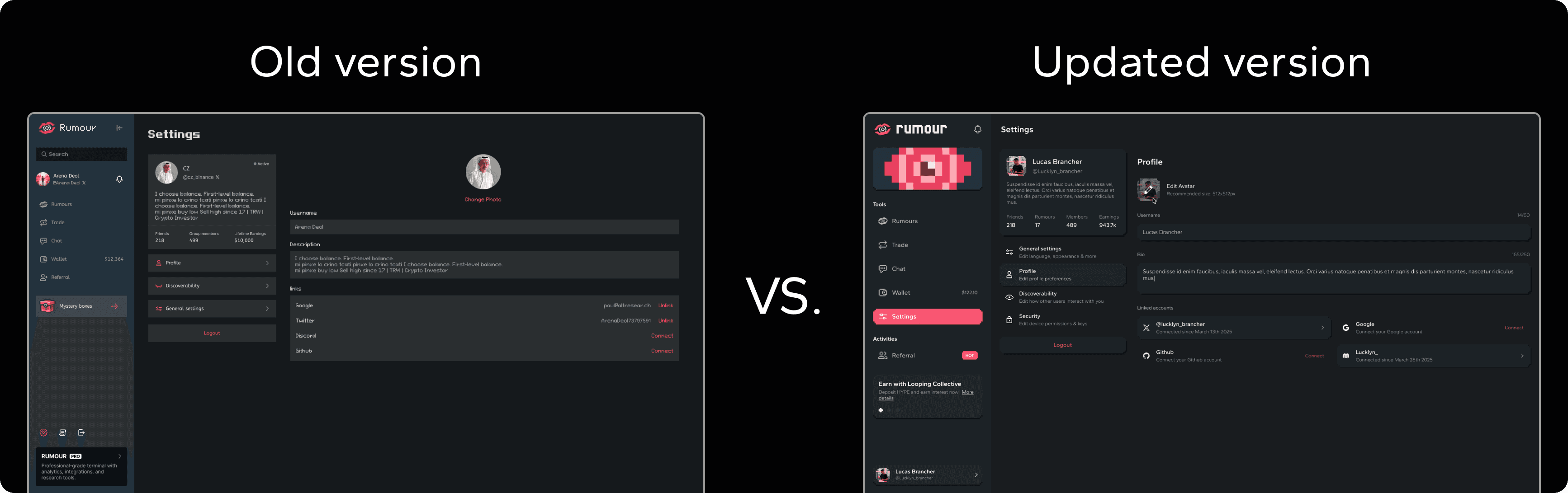
4️⃣ Intuitive profiles
The profile screens and configurations also needed some polishing. For that, we reorganized everything, ensuring sub-tabs and inner contents made sense within the user needs; Clear info is king!
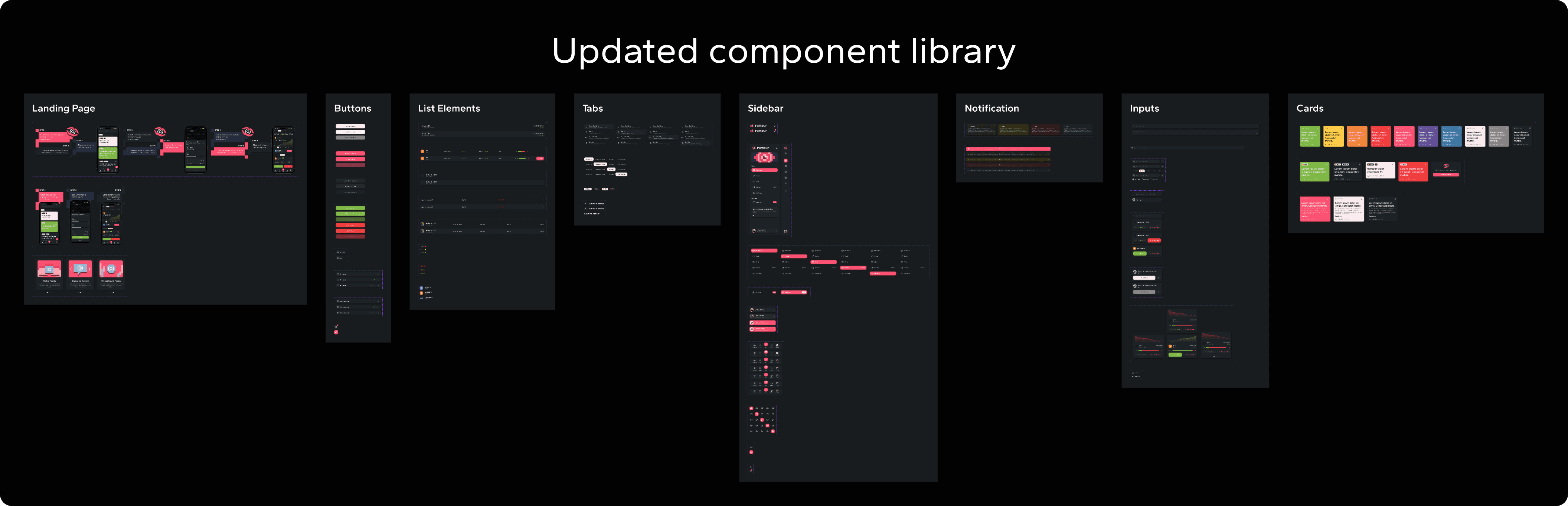
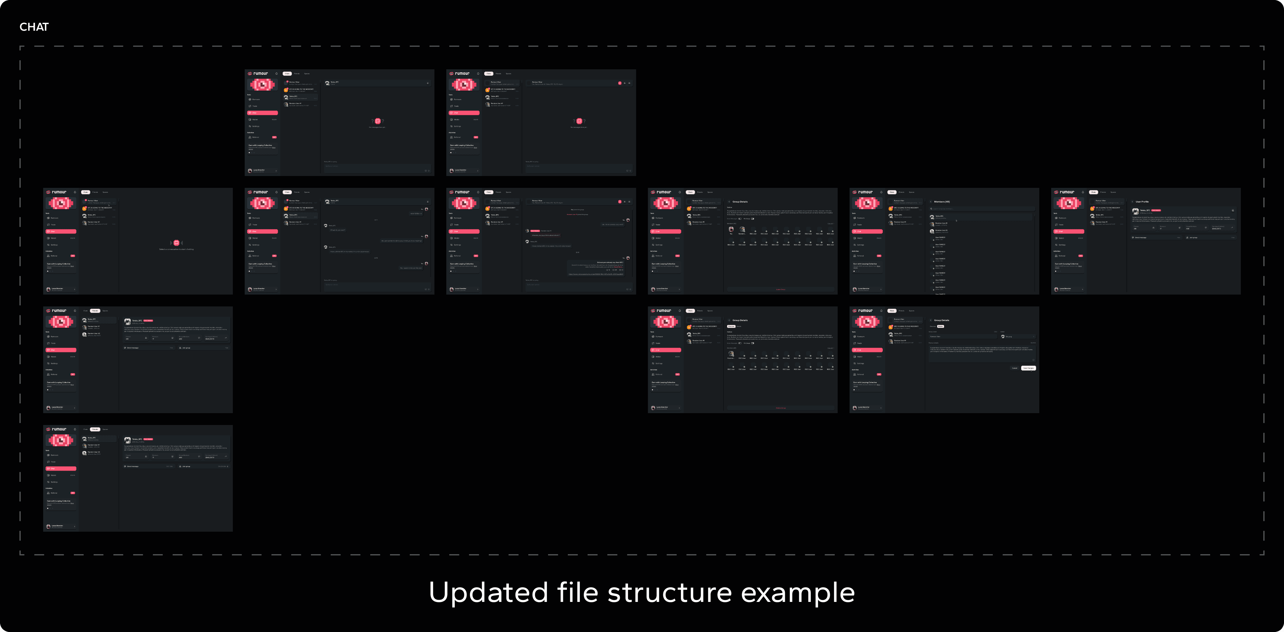
5️⃣ The Figma file
Where we had 37 desktop screens, now we have 104 of them; where there were no components, now we have a library of them, perfectly categorized; where there was no screen organization, now the whole file lies perfectly structured, the changes were immense, and the results clear. Now this project can scale!
The outcome
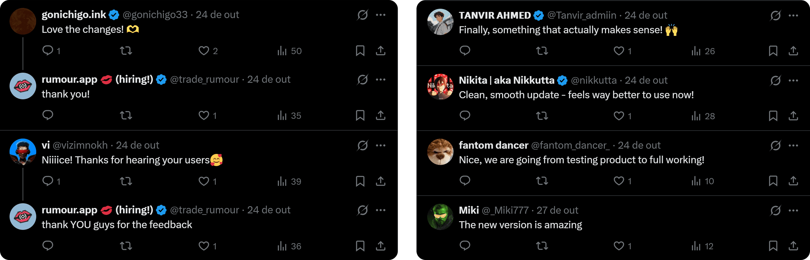
With the completion of this project, the Rumour App got a solid upgrade on all screens, Altlayer got a state of the art Figma environment to keep growing the project, and users got a few deserved changes for the better! The results? Let the people talk:
You can check a few selected screens from this project on the Figma window below:


