🏛️ HyperETH - Perpetuals & Trading
About the project
🤔 What is it?
HyperETH is meant to be a Perpetuals / Spot trading platform on Web3, that focuses itself on giving the user a tailor-made, efficient experience on trading, giving access to multiple tools that can make the experience more intuitive, well-informed, and straightforward.
🧠 Rationale
Nowadays, most trading platforms, mainly on Web3, are basically clones of each other, featuring the exact same structure, exact same information overload, exact same set of options, etc. The biggest selling point of these tends to be good marketing on social platforms, or better %'s of share when using referral programs, but… Where is the real thought on making the average trader's experience, who spends hours a day on these platforms, more intuitive, more informative, more user-facing? This is where my work came in when conceptualizing and helping Automata to create HyperETH.
🎯 The challenge
Create a minimalist, feature-focused trading platform;
Identify what works and what doesn't on already existing projects / platforms;
Develop features that can help the user diminish cognitive workload, allowing them to focus on what matters the most, making $'s!
Deliver a rich and intuitive experience that can fit users from multiple knowledge backgrounds;
Developing the concept
🔬 Research and analysis
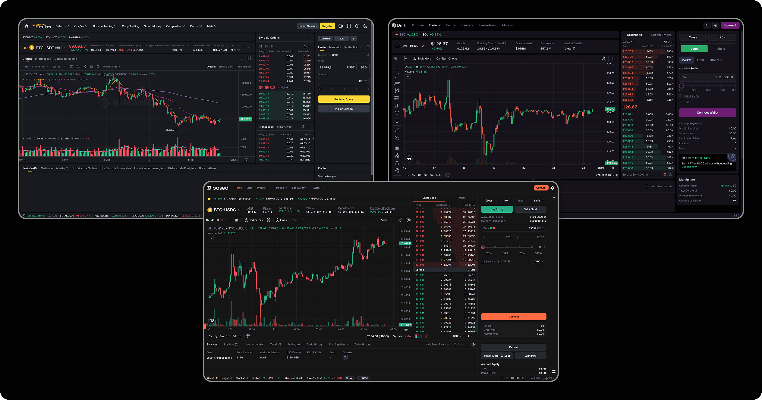
Since this project sought to understand all the successes and shortcomings of other Perp / Spot trading platforms on Web3, so we could build features to improve the already-existing status quo of UX for this genre, a good starting point was checking out other projects of the sort! Within the plethora of options in this industry, we chose Binance, Based and Drift. These feature pretty much the same structure, with some slight differences on tools offered and UI choices; By checking them out, we got a great grasp on what was missing, and what was done right!
🔍 Finding the edge
After some deep research, the next step was defining key-features and ideas that we would be offering to our users! Many concepts and verticals were brought up, and here are the best ones:
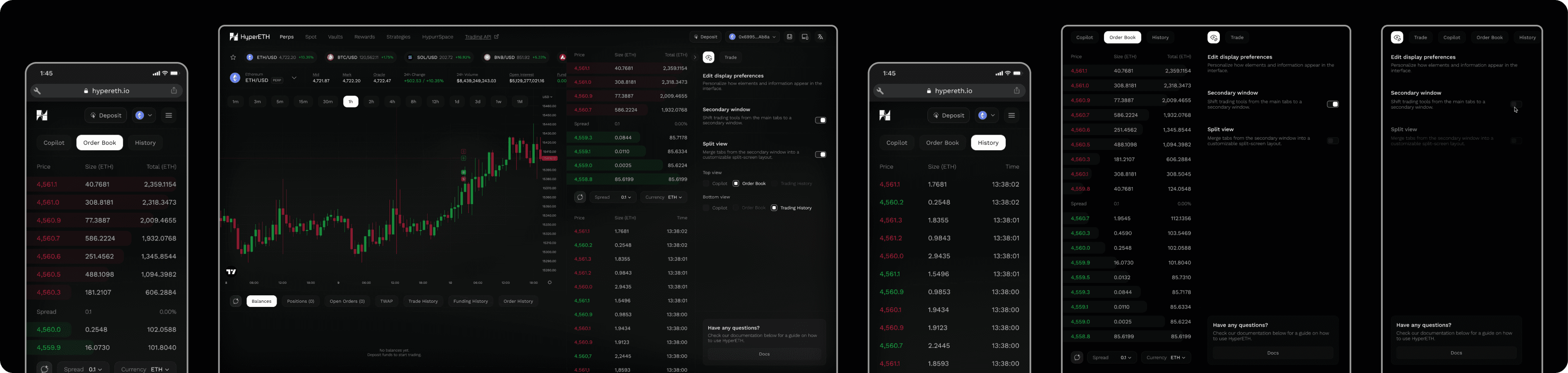
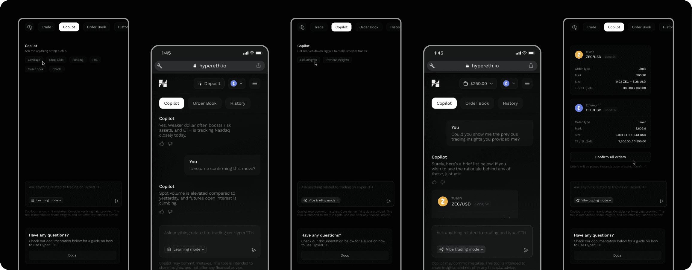
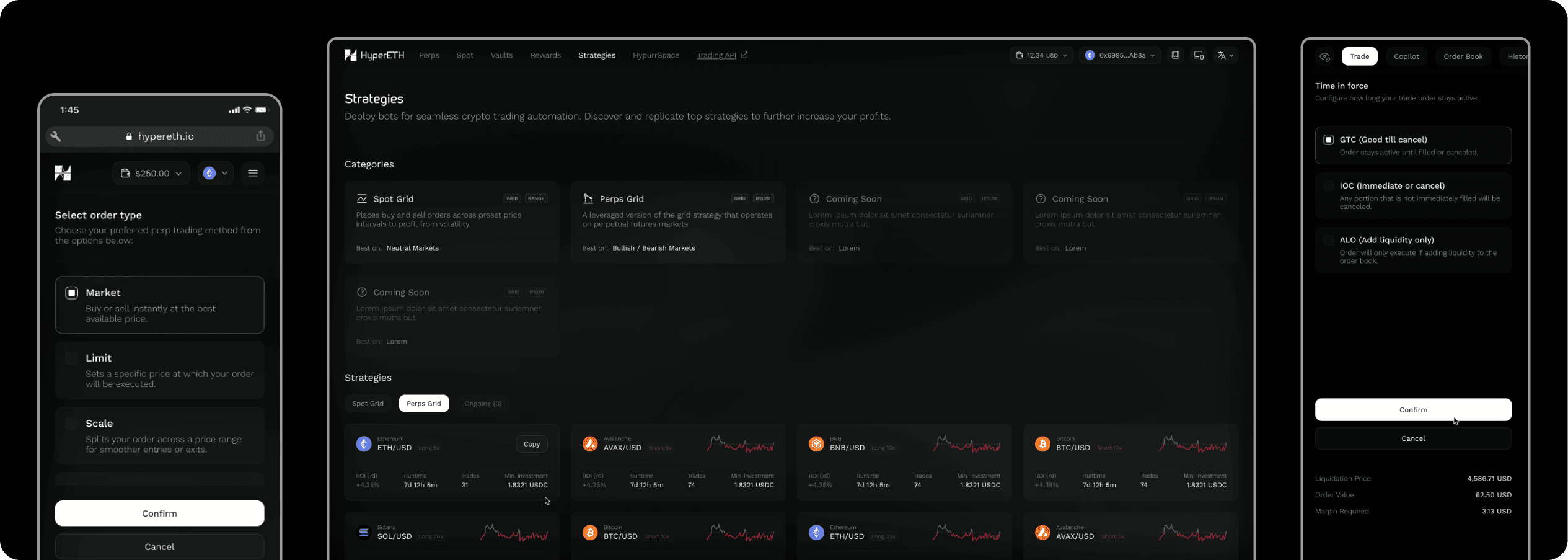
Custom interfaces / modularity:One of the main identified issues on existing platforms is the visual clutter. Too much info, relevant to some, irrelevant to others, can and will have the effect of overloading the user's cognitive workload. As a simple answer for that, we brought on reach, easy-to-apply interface toggles, that will allow the user to choose how much, and how do they wish to visualize trading info;Action-focused info:For many users that are starting their trading journey, the abundance of trading terms and lack of explanations on how every small process of a bigger flow works can be the biggest barrier on performing their desired tasks, sending them into hours of external studying so the bare-minimum can be obtained info-wise. For this, the main solution was adding specially positioned, well-structured bits of info, that will give precious context for those users who need it, while also not interrupting or cluttering the interface of the ones who doesn't;Agentic-powered trading (AI):As another resource focused on bridging the gap between users and the tasks they wish to execute, we also brought up the concept of having an in-platform agent, focused on answering questions regarding trading, going as far as even offering market analysis, with possible suggestions on trading pairs; this tool is the example of a win-win for all user types: newbies can have simple answers (going back to removing the need of external truth sources), while pros can get in-depth market insight, giving them the needed info to fuel impactfull decisions;Info in view, always:One of the biggest issues that was identified on all platforms studied, was the fact that, in so many cases, the main trading terminal would be obstructed by modals, pop-ups, etc. The main task of a trader is keeping up with the charts, planning the next moves, and this shouldn't be halted by any means! That's why this project went for as much of a modal-less approach as possible! With that, we kept a single area of the interface (right side) as the main focus point of actions, while always keeping in view what matters the most for the users.
Understanding the user
👤 Using personas
Now with a solid grasp obtained by researching and defining ideas, we were ready for the refinement step: creating our persona! As a quick reminder, personas are vital for understanding who your target user is, and what pain points you will be resolving for them. Your ideas and concepts brought up in the previous stage of research will be tested!
👨💻 William, 27 years (Web3 trader)
"Oh well, the market has been a rough one recently. Barely been getting sleep, and to make matters worse, I honestly can't pinpoint what I'm missing to get that next win! Maybe I need more trading knowledge, maybe I need better trading tools. The only thing I'm certain is that five or six new crypto trading platforms come up every week, and influencers keep swaying people like me into them. It's a tail-chasing game after all. Wish there were a better and definitive platform out there, something with nice free-to-use tools, maybe even some nice info sources to give me the edge I'm missing…"
💭 Motivations
Wants to become better at trading;
Wish to achieve financial success via trading;
Wants to have more info, knowledge, and tools for trading;
💔 Pain points
Is tired of getting swayed into multiple trading platforms that work exactly the same;
Is getting tired of the usual shallow experience of trading platforms;
Feels like he doesn't have enough tools or knowledge to achieve his goals;
Defining the user flow
📖 User stories
After understanding our persona, we created the user stories, which is the final step to tying our new design proposals with our end-user needs. Some examples below:
Modular interface:"As a user, I would love to be able to choose my own way of visualizing the info displayed on my trading terminal";Agentic trading:"I would really like to have a specialist with me, someone who can give me precious insights and explain to me concepts that I'm still missing";Multiple trading modes:"As a user, I want my platform to feature all possible trading modes, so I don't have to keep going back and forth between different websites";Intuitive info:"Sometimes I feel like my usual platforms are not giving me enough context on my trading activities. What even is a TWAP?";Core info focus:"As a user, I want to have access to the most relevant sets of data and charts at all times, as those affect my decisions directly";
🫚 User flow
Having all of these done, we created our definitive user flow! This design methodology tool shows us a linear view of how we expect the user to interact with the platform proposed. Below, I've added a Figma window displaying a simplified version of the original flow:
Working on the structure
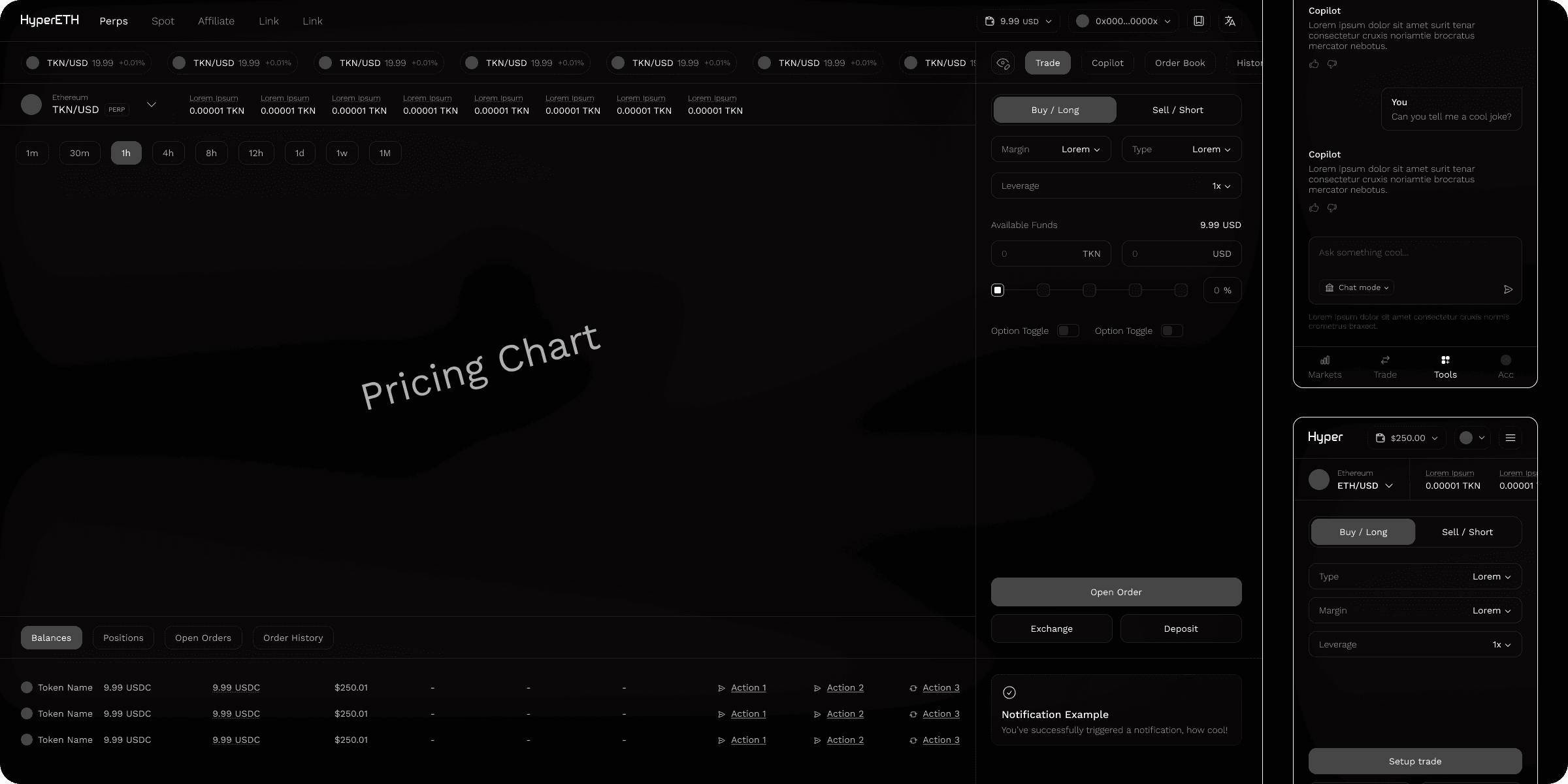
✏️ Wireframes
With a working user flow, the creation of our wireframes was the next step! This is a vital part of the UX process that allows us to understand some key interactions on our project and get some screen ideas flowing:
Working on the visuals
😎 Setting the mood
With our wireframes done, we needed to define a visual style. This would be our compass through all the UI decisions throughout the rest of the process. For this interface, the key words are: clean, modern, and sleek with a minimalist approach;
🎨 Colors
When it comes to colors, following the clean and modern path is pretty straightforward. For that, we chose some dark tones, and a simple white-on-black approach. This choice is not only great looking and time-tested, but also helps in reducing eye strain on our users, since this is the type of platform that does demand more screen time;

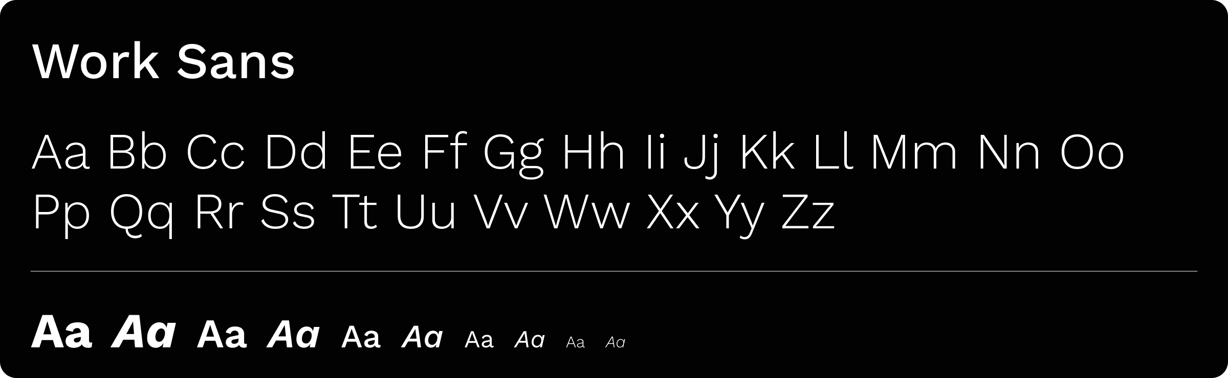
✍️ Fonts
For fonts, something sans-serif and with good readability is key, and for that, we went with a font commonly used on many projects: Work Sans! This font is a multi-weighted, free-to-use choice that brings everything this interface needs when it comes to versatility and being easy on the eyes;
Shapes
This choice can be divided into two different use cases: the terminal and the aggregated ecosystem;
For the first one, we went with a heavy focus on stacked block structures, with sharp borders, placed together on a bento-like structure. The focus was on making the structure as minimal and non-visual calling as possible, leaving the visual focus on the action areas;
For the latter, since we're talking about affiliate spaces, secondary tools, promotional spaces and such, a more round-bordered, free-form approach was taken, focusing on making the UI as smooth and user-friendly as possible;
The results
Within this project, a total of 220 desktop screens and 225 mobile counterparts were created. Within these, here are some of the results achieved:
1️⃣ Straightforward trading experience
Keeping an eye on where it matters the most, the metrics, the users can quickly deploy their positions, and manage them on a familiar yet fresh usage flow;
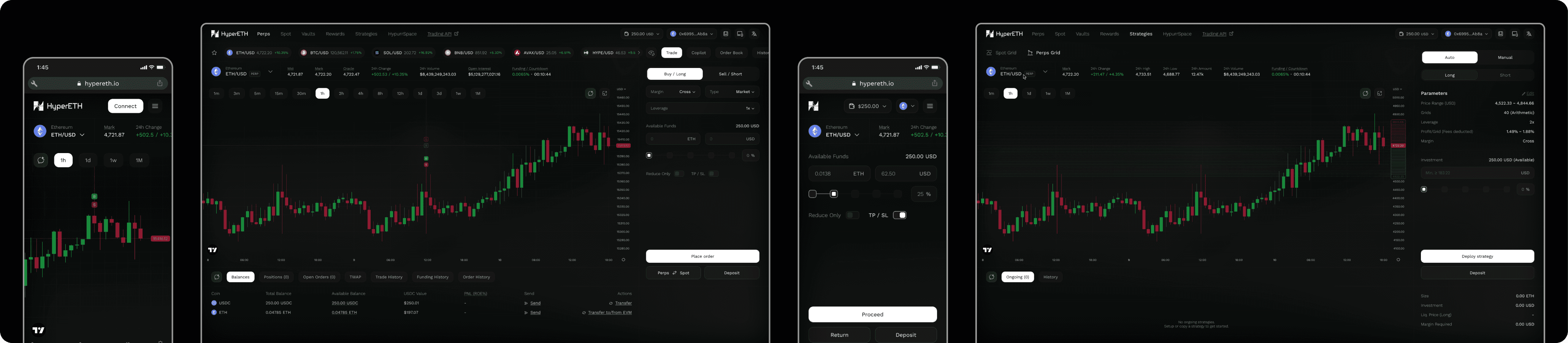
2️⃣ Modular trading terminal
With the usage of the modular approach, HyperETH's trading terminal presents the user with the choice of filtering how much info they want to see;
3️⃣ Multiple trading tools in reach
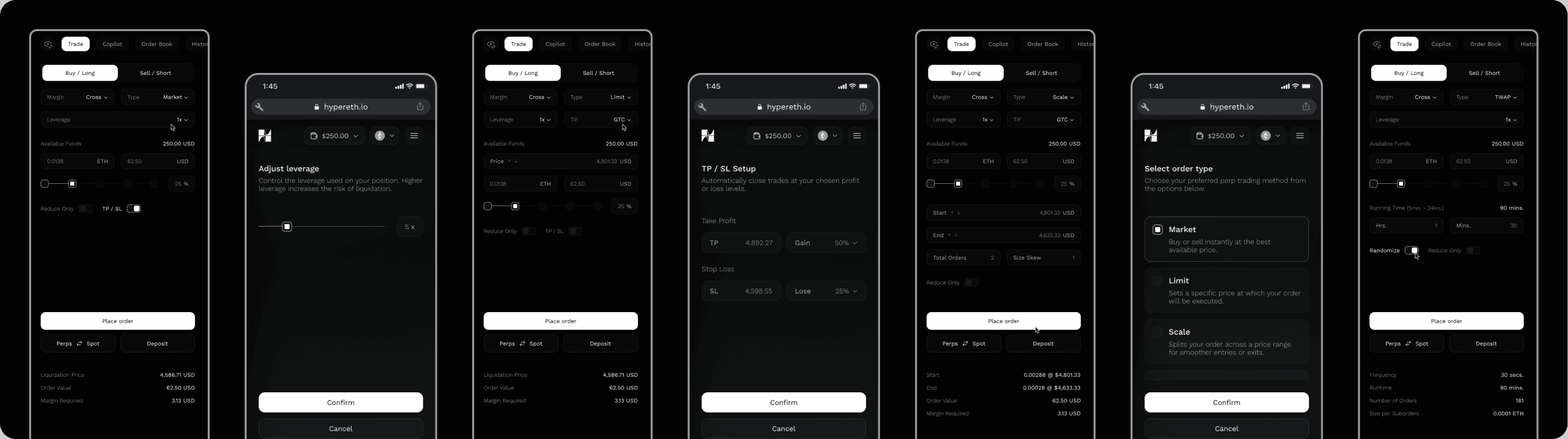
Featuring all the bells and whistles, HyperETH got released with multiple trade modes, and an ever-growing suite of tools made to give the user full control on their positions and trades;
4️⃣ AI-powered insights
With the Copilot integration, HyperETH can not only be its own source of trading knowledge, but also one of the first platforms using vibe trading, where the agents can suggest pairs for the user based on their desired strategies;
5️⃣ For all knowledge levels
HyperETH features small knowledge bits scattered everywhere in a non-intrusive manner, insuring that everyone has the needed info and context on their actions, no matter what;
The outcome
With the completion of this project, HyperETH was delivered and launched, reaching thousands of users and receiving multiple mentions on its ease of use, tool set offered, and quality of product all-in-all;
You can check a few selected screens from this project on the Figma window below:


